I think we all get the importance of trying to maintain positive client relationships. It’s a key part of this concept called Delivery Excellence. Especially in a consulting relationship, there’s really a difference between work product check-ins and statuses vs. “how is the relationship?” and “is value being delivered?”
Thinking about client satisfaction means considering (and keeping a pulse on) how your clients feel about working with you and your organization; not just after the project is over, but starting where we first pick up the ball and periodically throughout.
Teams are usually pretty good at understanding if we’re on track with the work itself that we’re tasked with doing, but often we’re not as good at picking up on how the collaboration toward those technical outcomes is working well or if we’re falling short of expectations (and not communicating enough along the way.) So, trying to keep these goals in mind can really help to avoid issues and cultivate some positive capital in case something does start to go awry… so we can better address it together.
Client Satisfaction Approach
So let’s talk about what this looks like generally. Of course, every project and client is different, but you'll need a plan for trying to get that feedback and another for how to do something with the feedback.
In line with the idea that we don’t want to wait until the end to become aware of these concerns, think about the ways you could bake in the feedback opportunities across your engagement. That could involve being very deliberate about creating those opportunities. Sometimes we need to try and elicit both the good as well as the not-so-good feedback when it’s not-so-obvious. I’d really like to emphasize: if you’re asking for this information, you have to be prepared for whatever answers come back; not only for what you want to hear.
You’ll then need to be able to talk about what you’re going to do with the feedback. It’s not going to be enough to just nod and be appreciative for your client’s candor. As project teams and delivery organizations, we need to:
track it
agree and assign ownership for it
follow up on it (amongst yourselves and with the client)
Following up will involve reporting back on progress towards change, improvements, or any other actions. These may be internally managed only, but in a lot of cases, there are going to be things you’re working on with client visibly.
Continuing on from an earlier post introducing some terminology around how to measure engagement within apps and sites, I’d like to continue with introducing a very basic framework for determining what to measure and considering how to display those measurements.
Let’s take a look at each of these four components:
Goals
You need clear goals to help you choose the right metrics. You really can’t start with the things you want to measure; you should select the things you want to measure based on any of these goals. We’ve got five categories… and they all interrelate:
Let’s look at some sample goals for a company’s intranet called ‘myCorptown’ across these different categories:
Adoption
Ensure new employees and new users are engaging with myCorptown content for the first time, including the email newsletter
Build employee buy-in by telling our story through our vehicles
Reach our employees ‘where they are’ including via mobile and kiosks
‘Give them what they want’ by being able to respond to the popularity of content
Get our employees to think of going to myCorptown first for company information
Engagement
Get our employees to give feedback on content including likes and comments, submitting questions, etc.
Have our employees be conversant in an informed manner about company news with fellow colleagues
Get our executive team to choose myCorptown as their communication vehicle
Get our employees to help each other (employees as communicators)
Retention
Get our users to return to myCorptown more often (more than 1x per week)
Encourage our lapsed users to return to myCorptown
Reduce stale content in areas on myCorptown where dynamic content is expected by our users
Task Success
‘Give them what they need’ in addition to what our users want, including via search
Solve our users’ problems via self-service where possible (without a help desk call)
Happiness
Ensure our employees are able to articulate the company story…
What we stand for
How does my work fit into the story
How does my work touch consumers
Support a more transparent culture at the company
Decrease frustration during activities on myCorptown
Support our employees through times of change
Signals
Eventually, we want to think about mapping goals to lower-level signals which are things we might want to consider monitoring. These signals are what we might be able to pay attention to over time in order to determine progress toward or to what degree we’ve fallen short of our goals.
Here are some of the example goals and the signals that could be identified for them:
Goal
Signals
Get our users to return to myCorptown more often (more than 1x per week)
Providing content relevant to users
Identify users who return to visit the site within a week period
Get our employees to give feedback on content including likes and comments, submitting questions, etc.
Identifying posts that have higher numbers of views
Identifying posts that have high numbers of comments
Monitoring submitted questions
‘Give them what they need’ in addition to what our users want, including via search
Identifying usage of tools and links that have typically been difficult to find
Monitoring search results for successful and failed queries
Metrics
Based on our signals, we’ll decide on things to measure… the metrics… like the number of home page views and the site’s bounce rate.
The measurements themselves are the key to everything, but rarely do we want to take the actual metrics and present them for interpretation by themselves; we need to provide some context and a story around the measurement. Just installing a web analytics tool, turning it on, and looking at digits tick up will not lead to any understanding around your goals.
KPIs
This is where we get into how to display the metrics that have been chosen to track the signals and tell a story about our goal, and I’ll present a few varieties again using examples from above.
Trends
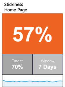
Here’s one that is a simple indication of home page stickiness with trending:
This KPI shows:
Number of retained user home page views minus bounces as percentage of all views
Over a time period of 7 days
Indication with color of current metric against target w/in a certain window
Trendline
Here’s another example with trending showing off-hours visits:
This KPI shows:
Number of views during off-work hour segments
Over a time period of 5 days
Indication with color of current metric against target w/in a certain window
Trendline
Trends w/History
Here we have an example of displaying a trend over time, bringing history into the context:
This KPI is showing us:
Number of posts related to influencers
Over a time period of 30 days
Indication with color of current metric against target w/in a certain window
Performance with color against last window and previous year’s window
This happens to be an example of where a higher metric is better; year over year the increased percentage is a positive indication, so it is green.
Here’s another example of trending with history showing submitted questions:
This KPI is showing us:
Number of questions submitted to portal team
Over a time period of 30 days
Indication with color of current metric against target w/in a certain window
Performance with color against last window and previous year’s window
The opposite of the previous example, here a lower metric is better; year over year the decreased percentage is a positive indication, so it is green.
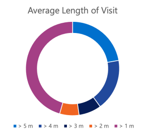
Snapshots
These next two examples are presented in different ways, one simpler visually and the other with more context; they provide the same data in a snapshot for a specific window of time.
Average visit length
Segmented into groups
Current metric for one window
Shows spread/breakdown detail
Does not show trend
Average visit length in minutes
Over a time period of 7 days
Indication with color of current metric against target w/in a certain window
Trendline
Here’s another example of snapshotting and two different ways of presenting the data. Note these example visualizations include a metric that is abstracted (into three different categories):
Rating of frustration level on portal from survey
Current metric for one window
Shows spread/breakdown detail
Does not show trend
Most common rating of frustration level from survey
Over a time period of 1 fiscal quarter
Indication of current metric against target w/in a certain window
Performance against last window and previous year’s window
Hopefully this series of examples gives you some ideas for how to think about showing what’s being generated from all your data! More important though you should have a better understanding of how to approach deciding what to measure based on what matters to track according to the goals you have for your site or app.
I find a lot of confusion out there when it comes to conversations about analytics for websites and applications. Here’s a brief primer for how to use the right terms in your discussion…
Metrics
A metric is a something that can be measured based on quantifiable data, or at the very least, estimated based on anecdotal data.
An example of a metric could be your heart rate or blood pressure taken by your doctor at a specific visit.
Key Performance Indicators (KPIs)
A key performance indicator (KPI) is a visual indicator that tells a story about one or more measurements, in context.
An example of a KPI could be the trend of your heart rate or blood pressure over a certain period of time. If the trend is upward, an up arrow might be used with the percentage of increase over that time period. It might be colored red if the implication is negative.
Web Analytics
Web analytics is the measurement, collection, analysis, and reporting of web data for purposes of understanding and optimizing web usage.
Web analytics tools such as Google Analytics mainly provide metrics for consumption via reports and APIs. What they usually don’t do is put them together in a nice PowerPoint deck to present to your boss!
Web analytics tools may already provide some KPIs in dashboards. These are more sexy and ripe for executive consumption. However, most practical KPIs are usually either:
Formulated automatically via additional software that process the metrics via APIs
Manually compiled by a site administrator
This is because most businesses want to answer very specific questions and monitor custom KPIs that aren’t readily available as an include with a tool.
Continuing on from sharing some perspectives on sprint retros (see my earlier post), here are some simple guidelines to get you started on running better sessions with your team:
Celebrate what’s great
Try to determine what is repeatable and sustainable.
Identify what to improve
Consider what (not who) is detracting.
Who
Only the actual team members should be included in a sprint retro:
The tech lead(s)/developers, designers, etc.
The product owner and project manager/scrum master
If there are client people who are actively working on the project (contributing to the sprint goal and the increment/work product), they can and should be included as well.
How
Come prepared with talking points
Someone from this group (a peer) should be able to facilitate
prompt people
record +s and –s
encourage participation (not pass judgment or validate/invalidate the contributions)
Try and propose a solution when identifying a problem
Review past retro points and gauge progress
Remember…
Team performance that continuously improves is the result of a team feeling accountable to each other!
You’ve probably been in these meetings and on these calls with your team… “Anyone have anything to bring up?” Crickets… but your project manager can say they ran the sprint retro and move on. This isn’t the way things should work and your team will never evolve without embracing this opportunity and substantively participating with courage. I’m going to briefly orient you with what the goals of doing this are—it’s not just a sprint ceremony to check a box on so we can say we’re doing Agile.
Your sprint has concluded and the team has held its sprint review. What we care about now is how the team thinks about working on that increment. Give everyone a chance to step away from the day-to-day and anything chaotic—debrief and decompress… amongst themselves. Feedback that we’re gathering here is from the team and for the team. People on the team are accountable to each other—this is not an external management review of the team’s performance or efficiency.
So with those goals understood, let’s review who we need and how to conduct these. Only the actual team members should be included in a sprint retro. This does not include anyone else—no exceptions. Others might review the output of the retro, but they are not invited to participate. In line with the team being accountable to each other, people need to feel comfortable to bring up concerns without anyone in attendance who doesn’t have an equal stake in what is affecting the team.
How to go about this? Come prepared—I can’t tell you how many retros I’ve been on where nobody speaks up. Self-select a facilitator from the group—they’ll record what is brought up and hopefully encourage participation. When you’re contributing a problem, try and propose a solution alongside it. And, have the previous retro summaries available to you can gauge progress from the previous sprints.
Instead of recording black and white feedback—what was good and what was bad, consider ‘do less’ and ‘do more.’ We really want to hold up and celebrate what went great! We want to identify those things that really propelled the team forward and maybe formalize some of them—get to a point where we can repeat and sustain. On the other side, we also want to identify what to improve—and important here to not point out who, but the things that held the team back… What is detracting from the team moving forward? What didn’t work so we can stop doing that thing and try a different thing that might be better?
I’ll get into some details of how you can run better sprint retros in a follow-on post soon!